creative and responsive websites
Development of creative and responsive websites for every screen.
HOW DOES IT WORK?
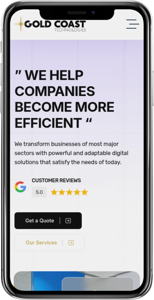
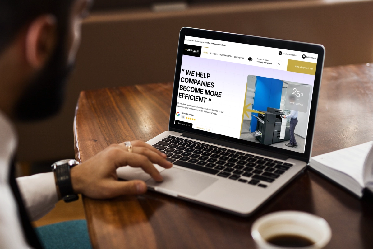
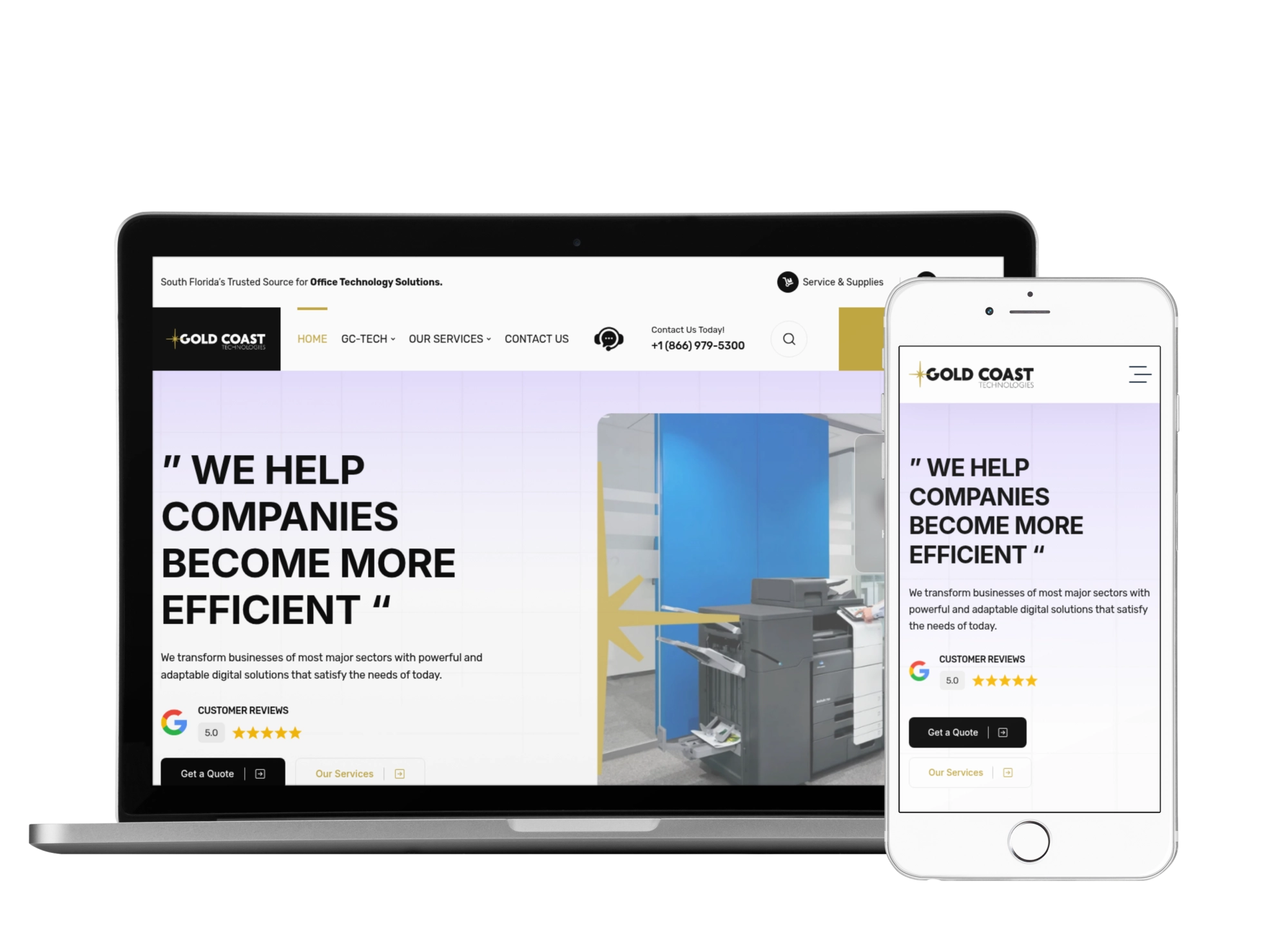
With all the current technology, more and more people access websites through their smartphones and tablets. For this reason, it is crucial to have a responsive website these days.
If your business does not yet have a responsive website, you may be missing out on many opportunities and customers.
The content of a responsive site can adapt according to the size of each screen. No matter if the user is accessing this content from a smartphone, tablet, notebook or traditional desktop.
So you can access the content in a much more practical way without having to zoom in on your screen. The information becomes much clearer and the browsing experience of the user much more pleasant.
NEED TO DEVELOP A
RESPONSIBLE WEBSITE OR CREATE A BRAND,
CALL US?
+ RESULTS – Advertising in local media the result is not always desirable. But on the internet your chances are higher to reach new customers.
OUR WORKING PROCESS
Steps to follow to obtain results.
-
PLANNING & STRATEGY:
Establish all the requirements for the creation of the site, define its objectives and plan the development of the project. -
DESIGN & DEVELOPMENT:
Starting and executing the project, using images and texts sent by the client, so we leave the site with the face of your brand. -
TEST & DELIVERY:
With the project completed and published, we will test all the features, and everything is ok, the project will be finished.
Ready To Transform Your Business?
Book a Free Consultation.


